Monday, 7 January 2013

Narrative and Structure

Narrative and Structure
Storeys are the base for almost everything history,culture ,techniques anything and everything is passed though generations by story's. a story's can start from many places news, history/legends, reports/descriptions, rumours, hearsay and gossip. A story wouldn't be any good if it dint keep our attention or in for us so there are some thing that can and are don't to enhance story's.  the journey if the journey the charter take is bland and interesting the listener reader is highly unlikely to finish the story, journeys usually take up a large part of the story so if the lisper/reader finds it boring the whole story is flawed.
Experiences (Personal/non Personal) can pull the reader/listener into the story and make them believe what is being said, it can also make a story true and realistic.
Once you have your story and will be able to keep the audiences attention you will have to think about communication what type of audience would your story be most effective to? young, old, school children, students, OAP.... what is your story intended to do is inform directly or inform in a mild way or be an enjoyable tale? there are ways to convey your story that could help, for example photos, drawings, videos... this can help the reader/listener related and think about story in-depth. finally they way you print your story is key PowerPoint, speaking, book, interactive tablet.. the list with technology is endless. 

Tuesday, 20 November 2012

Image and Text

Photos most of the time convey there purpose or meaning strait away thought the message, meaning... can sometimes be distorted. By adding some text the message of the photo becomes clear and if presented in the correct way still allows the viewers mind to wander and imagine.

This house look plain and simple thought slightly run down you would not guess what this photo was depicting without and text or research. This small hose was built on ground sold to the government from a chemical producer who used it as a tip to dump there rubbish and waste. The waste now under the houses was causing illness and informative in the babies born and brought up on this land.
The text can change the mood of a photo something that looks quite beautiful could become a murder scene. This text can also entice the viewer so the might take a second look or be attacked to something they dismissed before.

Text rather than added after can be integrated into the photo and or become the focus. Sometimes the photo can be created for the purpose of showing the text rather than the other way round. For example someone holding a board with text on looking successful e.g. in a suit but the text is a plea to help escape the rat race. The photo was created with the idea of conveying emotion and that a face dose not tell all. 

Text can be needed rather than wanted as people can be a fended that you have not told the whole story and just taken a possibly horrid photo which has a perfectly reasonable explanation. A picture can tell a thousand words but not always the exact truth.

Interpretation and Delivery


Key Principle 1 - Interpretation
Activity - Compare two interpretations of the same subject and how they can be seen as representing a specific the time and place and how this has affected the work.
Batman TV series joker / Batman the dark night 2008 film joker
The 1966-68 television series featured actor Adam West as the Caped Crusader, and
Burt Ward who donned nylon stockings and fairy boots for his portrayal of the
erstwhile sidekick. The TV show was bright colorful and comical,which was aimed
towards a family audience and was a way to show off the bright colors on the newish 
color TVs.Many of the bad guys were devious and broke rules but never anything 
exceptionally bad. The joker was original a criminal in a clowns outfit, which related to
the family audience with some children having a fear of clown. Cesar Romero portrays 
the character in the 1960s Batman television series. The Joker of this series is 
characterized by a cackling laugh and comedy-themed crimes, such as turning the 
city's water supply into jelly and pulling off a stand-up comedy-themed bank heist. In 
one episode he competed with Batman in a surfing contest.
The 2008 joker played by the late Heath Ledger is a  murdering sociopath who
 terrorizes Gotham City and whose goal is to plunge it into anarchy. the 2008 joker 
wheres the costume because the scars he has on both cheeks matches in with a clown
wide smile what makes this joker even more scary is that he never gives the same
answer to how he revived the scars,giving the character mystery which enhances his
insane state of mind. the 2008 film made batman real relating to many technologies of
the time and showing death and destruction. The deth of one of the main characters
really made this hit home this is something that was never thought of during the TV 
series thought clif hangers happend the story line never realy continued more than
2-3 shows.

Key Principle 2 - Delivery

Activity - Look at how Creatives are embracing new forms of media/ technology to deliver the message.....

Dry The River horse advertising

Dry The River Horses: 3D Paper Poster 


A group called FOAM created these huge paper-craft posters for RCA band Dry the
River. they designed the 3D horses in Google Sketch Up before printing out all of the
component parts and assembling them by hand. Each poster took around 35 hours to
complete.Once they were built they were hung around London with the help of hammer
and some rusty nails. to advertise the posters themselves they a charming short film
showing passers-by reacting to the posters this i found was enginouse anyone not
lucky enough to vie these remarkeble horses could still see them through the video
advertising them in turn advertising the band which they were originally created for. the
video is on you tube which so many people use now i have put a link under the photo.
 

Monday, 29 October 2012

What makes a visual communication legible?

What makes a visual communication legible?

Find examples of visual communications that are legible or illegible and explain why.
Above is the London underground map of the subway. This to me is very legible when it is on the large underground walls, but when converted to a small hand map this become like a web of color. the map in handheld form is very small and hard to read but after reviewing the london area it is a very large area to cover  and then to have all of it fit into the paim of someones hand is very good. the righting is readable for me but anyone with poor eye sight would find this hard to read.The large maps in the underground/subway  are very legible and clear from them i can understand where to change trains and which line of train of be on. The use of colours helps clearly identify the tracks from each other and the background. The background is made up of light coulours as to not confuse and distract the audience. but the background is still clear when you need it it identifies the areas the stations are in.

 CRITICAL COMMENTARY ON VISUAL HIERARCHY

 Find examples of visual communications that show a visual hierarchy (or lack of hierarchy) and explain why.

The visual hierarchy in the advent above starts with the central colored illustration/image then to the black game device, then the quote and finally the above the quote some brief information. the bright colours imediatly catch your eye draw you in and then your eye is drawn to the small black box which is the device. the device has the logo/ mack on its screen so if you don't immediately know what the device is. the hole advert draws you in tempting you to buy the item.

Where do illustrators, designers, etc find inspiration?

Inspiration don't appear out of thin air you must see hear, touch, smell something to first be inspired. Almost every artist makes notes of inspiration in their sketchbooks, notebook or journals these them self can appear to works of art. They are composed of a mixture of media, for example rubbings, photographs, clippings any think that the artist finds inspiring. Inspiration does not have to be confined to book it can spread to walls boards many studios ranging any subject. It is a way artist can inspiration quickly and all the time, occasionally work can be misguided or forgotten in books.
Constantly taking photos is a great way to store inspiration and if done correctly can be the perfect way to look back and research on the place or item.
"if there is something I really like it ends up on my wall"
Rian Hughes"I feed myself as much information as I can from my research and hopefully it filters into my illustrations"
Im not sure I actually switch into research way of thinking, its more of a continuous on-going process involving keeping your eyes peeled at all times.
Jon Burgerman - Illustrator

    What is the role of the Audience?

The audience is who you need to appeal to with out an audience what is the point of communicating a message. the audience is who you need your work to appeal to and setting that audience is one of the fist things you must do. is your target audience students,children,artistic,older... setting your target audience dose not have to stick to age ranges it is better if you avoid age ranges and think... what might my audience job be? best thing to do is start building up a visual of how your audience might look. once you have identified your audience you can start developing your work basing it on that visual you have of your audience. as the process commences it maybe a good idea to research your audience because what you think they might like might not be the right choice.
the audience can define your work or set your on a new path. your work must always reflect the audience if it dose not if might make the piece of work unreadable or give the wrong message to that particular audience


Monday, 22 October 2012

Notions of Originality


"Steal from anywhere that resonates with inspiration all fuels your imagination."
The idea of something being original is the aspect of something being new. It has not been reproduced or forged. Past artwork has a big impact on contemporary pieces, many pieces being recontextualised and turned into something new, making it unoriginal. This can also be called paying homage to a particular artist or piece of art.
 

It is clear to see in pictures above that Matteo has taken inspiration from Andy Warhol pop painting of Marilyn Monroe, but giving it his own modern twist, the colours are similar but the composition is different and using a contemporary model. By sticking to Andy Warhol pop art colours it means painting by Matteo is recognisable.


Managing a Creative Environment


Creativity is more than the internal thinking process it can be influenced by your working environment, culture and personal interests of the illustrator/photographer/designer.
The workplace can assist in the duction of creating ideas and the development and their implementation.

Stimulating workplaces can help to expand the creative person's mind and ideas. Culture and tradition can help create diverse and unique ideas.
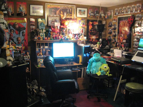
Collecting is whatever form can have an influence on our work. Collecting can be sketchbook work, photographs, rubbings and anything you find interesting and relates to the topic you're looking at. Collecting can also be reflection on your own interests as creative practitioners and other artists work.

Looking at Mel Miltons workspace it is full of animated characters from different films these could be an inspiration to his work. When I first saw the photo of Mells workshop I thought it was disorganize and no workspace, but when looking closer it's very organized for example the Star Wars on the right wall. Though there is limited space to work there is space for computer, scanner and other equipment animators might need to use. Everything that eye level and above is collected inspiration which is very colourful and he could probably use to develop future ideas.